Energy Use in California
The next few posts on this website will be based on emails that I have been sending to the Applied Mathematics and Statistics department every Monday as part of a reminder of the weekly doughnut social event that I help facilitate. In many of those emails, I include a data vizualization with very little explanation. I’ll include more here, like the motivation and the thought process, as well as the code and data source used to make the visualization.
Having lived in coastal California for about 3.5 years now, I’ve grown used to a social climate that favors sustainability. Many homeowners here invest in solar energy, and I think many try to cut back on their electricity usage as much as they can. I was surprised to find that the electricity usage data is posted online by the California Energy Commission. However, this dataset only gives the pure energy usage in gigawatt hours. Comparing the raw energy usage in, say, Los Angeles county to one of the counties in the eastern Sierra region does not make sense. Therefore, I decided to try to calculate the usage per 1,000 people using information from the California Department of Finance. The code and the final plot can be seen below:
library(tidyverse)
library(readxl)
library(magrittr)
library(maps)
library(ggmap)
library(RColorBrewer)

data("county.fips")

ca_counties <- grep("california",county.fips$polyname)
ca_fips <- county.fips[ca_counties,] %>%
  mutate(County = toupper(substring(polyname,12)))

elec <- read.csv("~/Downloads/ElectricityByCounty.csv")
pop <- read_xlsx("~/Downloads/E-1_2020_InternetVersion.xlsx",sheet=3,skip = 2)

pop %<>%
  dplyr::mutate(County = toupper(`State/County`),
                Population = `Total Population 1/1/2019`/1000) %>%
  dplyr::filter(County != "CALIFORNIA") %>%
  as.data.frame

elec %<>%
  set_colnames(c("County","Sector","Electricity","Total")) %>%
  dplyr::select(County,Electricity) %>%
  dplyr::mutate(County = as.character(County))

pop_elec <- left_join(pop,elec,by="County") %>%
  dplyr::mutate(elec_per_cap = Electricity / Population) %>%
  left_join(ca_fips,by = "County")

pop_elec$elec_bin <- as.numeric(cut(pop_elec$elec_per_cap,c(4,6,8,10,12,14,16,18,100)))

col_pal <- brewer.pal(8,"PuRd")
leg_txt <- c("4-6 GWh/1000 people",
             "6-8 GWh/1000 people",
             "8-10 GWh/1000 people",
             "10-12 GWh/1000 people",
             "12-14 GWh/1000 people",
             "14-16 GWh/1000 people",
             "16-18 GWh/1000 people",
             ">18 GWh/1000 people")

par(mar=c(0,0,0,0))
maps::map("county",regions = "california",col = col_pal[pop_elec$elec_bin],fill = TRUE)
# title("California Energy Use (GwH/1000 people)")
legend(-126,36,legend = leg_txt,bty="n",fill = col_pal,cex = 0.6,xpd=TRUE)
text(-116.5,40,labels = "California\n Energy Use\n (2017)",cex=1.3)
mtext(side=1,line = 0,at = -119,
      text="Sources: ecdms.energy.ca.gov/elecbycounty.aspx and\n http://www.dof.ca.gov/Forecasting/Demographics/Estimates/E-1/",
      cex=0.6)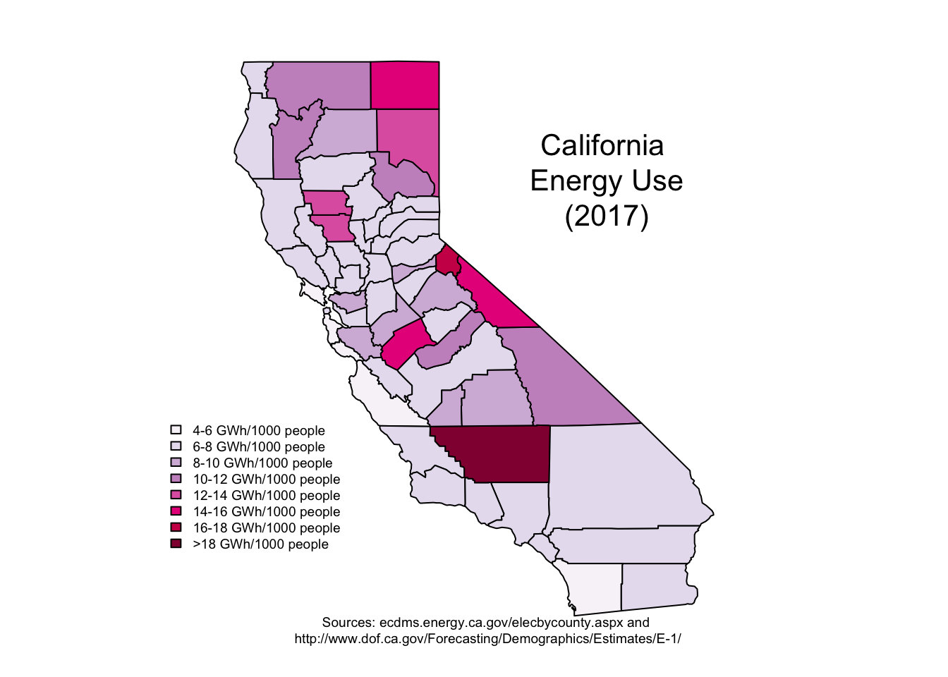
Note: As I originally made this post in 2018 and just moved this over to my new website, I had to redownload the data. There is now a slight inconsistency in the data: California only has county population data available from January 1, 2019, and January 1, 2020. Therefore, the rate is slightly inaccurate. However, the basic patterns are still there: Heavier electricity use rates off of the coast, and a much higher use rate by Kern county.